Project Name: Carbon Platter
Software Used: Adobe Illustrator, Adobe After Effects
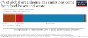
This was a project set in the final year whilst at the University of Portsmouth. I was asked to produce an infographic that demonstrated a current social issue. I chose to focus on the CO2 production of different food groups which I believe is not as well as publicised other issues regarding CO2 ommissions (e.g. buring of fossil fuels).
The first task was identify the key statistics that I wished to highlight on these particular CO2 ommisions. There were a number of web sites I researched which included the BBC, WWF, Our World In Data, Visual Capitalist, etc.
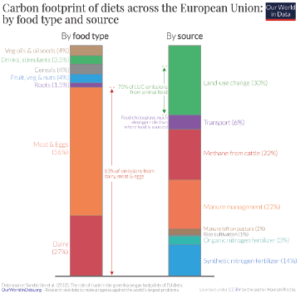
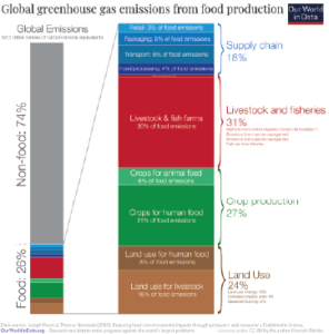
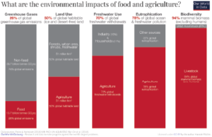
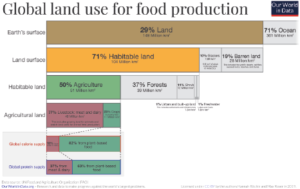
Our World In Data (IWID) has some extremely powerful statistics but I personally found that their method of communication was not particularly engaging. I was able to download a lot of the information I used in my infographic from the IWID website in an excel spreadsheet. My task then was to present key information in a visually accessible manner.
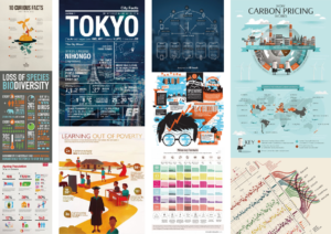
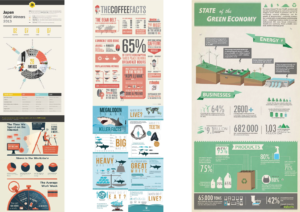
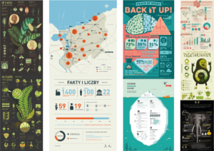
I then considered the visual style that I wanted. I initially researched eye catching infographics in a range of different subjects to allow me to experiment with a wide visual range. After reviewing over twenty different approaches (see below), I then narrowed my thinking to one or two core styles.
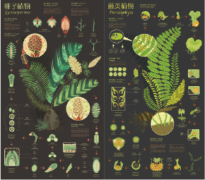
My preferred look was dark textured backgrounds and light white text which works well on a digital format (as opposed to print versions). The colour scheme that I chose was inspired by a Japanese plant infographic which I found on Pinterest. The colours all represented those that can be found in nature which I felt was appropriate given the subject matter.
I believe it is important selecting a font style that is keeping with the tone of voice that I am trying to project. My aim was to make this easy to read, approachable and informal as opposed to a lecturing approach, which is an obvious temptation. As such I selected the font ‘Sofia Pro’ as it was an Sans Serif. Sofia Pro is seen as “pragmatic as it is friendly” and is often used in headlines and captions.
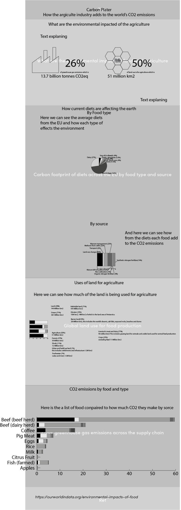
My first step in constructing the Infographic was to plan out the various sections. These included the enviromental impact of agriculture in general and then where CO2 was created in the production process. I used a variety of charts to break up the message. This included bar charts, a ‘donut chart and a stacked horizontal bar graph. Additionally I used simple icons to illustrate key facts, such how much green house gases are produced by the agricultural industry and how much land use is involved.
I had a number of drafts, before I finalised my thinking (see attached). The earlier drafts were rejected as I felt that they could be improved to make the wording easier to read. In practise I found that ‘less is more’ – less crowded facts allowed the key points to ‘breathe’.

In addition, I produced a motion graphic to go with this work. The moving images used the same core information but hopefully it made it more memorable.
To below is the full video for the motion graphic and to left is the full infographic.
