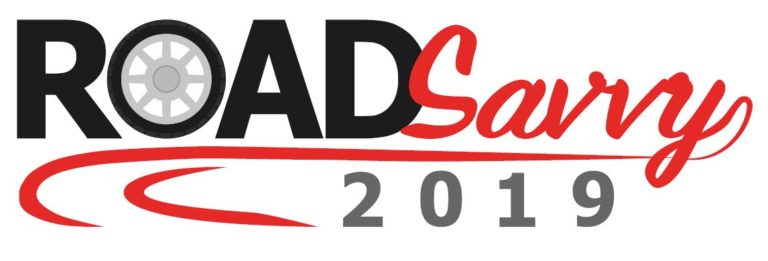
Project Name: Road Savvy
Software Used: Adobe Illustrator
‘Road Savvy’ was a project given to me by the Head of Communications at Kent Fire and Rescue Service. It involved the creation of a logo for a joint initiative with the Kent County Council to promote safe driving. Clearly the logo was meant to represent this idea of safe driving in a concise and simple to understand manner.
Apart from having to use the words ‘road savvy’ in the logo, there was no other direction given. I felt that the most important part of the logo was how the icon interacted with the lettering. I brain-stormed a range of ideas linking the lettering in ‘road savvy’ to motore veicles. For example, the ‘o’ within road could be turned into a car wheel, using a road as a line under the wording, using famous car badges within the words and changing some of the letters to represent traffic conditions. I deliberately used a limited range of colours within the logos as I wished to focus simply on the main message. Silver and black were the key colours as these represented metal and car parts. A number of the designs can be seen below.
The Head of Communications slightly the sizing of the text and amended the waviness of the road. (See below)


